Website strategy / A practical guide
Why your website gets traffic
but no inquiries.
Before you rebuild your website or buy more traffic, check what happens between a visitor arriving and deciding to get in touch.
People are visiting your website, but your inbox is quiet. It is tempting to assume the design needs replacing. That may be part of the problem, but a traffic count alone does not tell you what to change.
A visitor might be researching, looking for a job, comparing suppliers, or trying to buy something you do not offer. Even the right visitor may leave with a basic question unanswered: is this business right for me, and what happens if I contact them?
This guide is a practical review method, not a promise of more leads. Work through it using your own pages, traffic data, and inquiry records.
1. Check who is arriving before changing the page
Start with the pages people land on and the source of those visits. Separate search traffic, referrals, campaigns, and visits you generated while testing the site. Where available, look at the search queries or the message that brought someone there.
Someone searching for a free template has a different goal from someone comparing a custom website service. Both count as visitors. Only one may be considering the work you sell.
Write down three things for your most important landing page: the likely visitor, the task they came to complete, and the action you want them to take. If those do not fit together, revise the traffic source or the page's promise first.
Read the advertisement, search snippet, or referral message immediately before reading the landing page. Does the page deliver what the visitor was led to expect?
2. Explain what you do in language a buyer can use
A memorable headline can give a business character. It also needs enough supporting detail for someone unfamiliar with the company to understand the offer.
Your opening section should make the service, intended customer, and next step easy to find. Further down, explain the actual deliverables and any important limits. A buyer should not have to translate a list of capabilities into a project scope.
Illustrative copy example
Vague: “We create exceptional digital experiences.”
More specific: “Website design and development for businesses launching a new site or improving an existing one. Explore the work, then tell us what you need.”
The second version gives the visitor something concrete to evaluate. Your own wording should reflect the services you actually deliver, rather than imitate another studio's promise.
3. Show evidence that helps someone choose
Good-looking work is useful, but a buyer also needs context. Explain the brief, the decisions you made, what you built, and how the result works. If a project is a studio concept, say so. If you report a business result, explain where the number came from.
Evidence can include a working example, a walkthrough of a difficult interaction, a clear project scope, or a genuine client review used with permission. Pick evidence relevant to the service on the page.
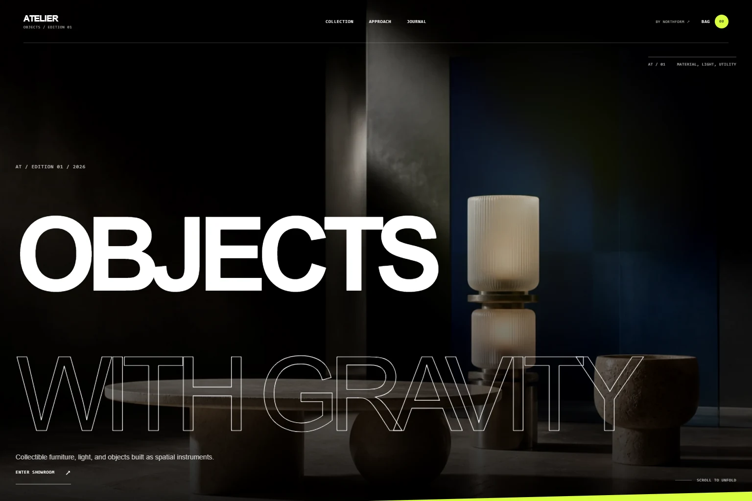
For example, Northform's ATELIER commerce study is a studio-built example. It lets a visitor inspect product browsing and material selection. It demonstrates interface decisions; it does not establish an increase in sales for a client.
Also explain who will do the work and how the project is managed. A prospect may like the design and still hesitate because they cannot tell who they would be working with.
4. Make the next step clear and proportionate
Decide what action makes sense at this point in the buyer's decision. For a tailored service, a project inquiry may be more appropriate than a purchase button. For a straightforward product, the visitor may need delivery details and checkout instead.
Use a button label that describes the action, such as “Request a project estimate.” Explain what follows: you review the request, clarify the requirements, and propose a scope. Only promise response times you can consistently meet.
Place the action where someone has enough context to consider it: near the initial offer and after relevant work or service details. Keep supporting options, such as viewing examples, available without making every section ask for a different commitment.
5. Test the whole inquiry, including delivery
A form is only useful if a genuine request reaches the person responsible for responding. Submit a controlled test with your own details and check the destination inbox. A confirmation displayed in the browser is not proof of inbox delivery.
Ask for the information needed to begin a useful conversation. For a custom website inquiry, a name, email address, and short description of the project can be a starting point. Company details, an existing website, and budget context can be optional unless your qualification process requires them.
Mark required fields clearly, use visible labels, and explain the expected format when necessary. These are also part of the W3C guidance on form instructions.
Check what happens when something goes wrong. Does the form explain the problem, preserve the message, and offer a way to try again or contact you directly? Avoid making a prospect rewrite a detailed brief after a connection failure.
6. Follow the journey on a phone
Open the landing page on a phone and complete the same task a customer would. Read the service details, inspect an example, open the menu, and reach the contact form. Watch for text that is difficult to read, overlays covering buttons, and layouts that shift while you are trying to tap.
Performance tools can help locate technical problems. Google's Core Web Vitals cover loading, responsiveness, and visual stability. Combine those measurements with a real walkthrough: a technically fast page can still leave the offer unclear.
Try navigating with the keyboard as well. Links, menus, and form fields should be reachable, and the focused element should be visible. Treat accessibility as part of whether a customer can use the site.
A short review you can do today
Choose one important landing page and follow it through to a confirmed inquiry. Record the issue and the smallest useful change at each step.
- Arrival: Does the page match the reason someone clicked?
- Offer: Can a new visitor explain what you sell?
- Evidence: Can they inspect relevant work and understand your role?
- Action: Is the next step visible, with a clear explanation of what follows?
- Contact: Can they submit a request, and do you receive it?
- Follow-through: Is someone responsible for responding and recording the outcome?
If the form is broken, repair it first. If the traffic does not match your offer, work on targeting and relevance. If buyers cannot understand the service or find evidence, improve those parts before deciding whether a complete redesign is necessary.
After a change, compare similar traffic sources over a meaningful period. Track relevant inquiries and the projects they become, alongside visits. A few additional clicks or one new inquiry are useful observations, but not enough to prove that a design change caused an improvement.
If the review points to a larger project, use the guide to what a website redesign includes to define the content, functionality, migration, and handover before work begins.
Put the review into practice
Have a website you want to improve?
Share your current site and the part that is not working for your business. Northform can help define the structure, design, and development work your project needs. Scope and cost are discussed individually.
Discuss your website Explore the services →